Creating an optimized PowerPoint presentation
How do you design slides that are fluid, airy, dynamic and captivating? Especially when they are then used to create a professional video?
Whether it’s for training MOOCs, courses, virtual classrooms or webmeetings, a well-designed PPT presentation is key!
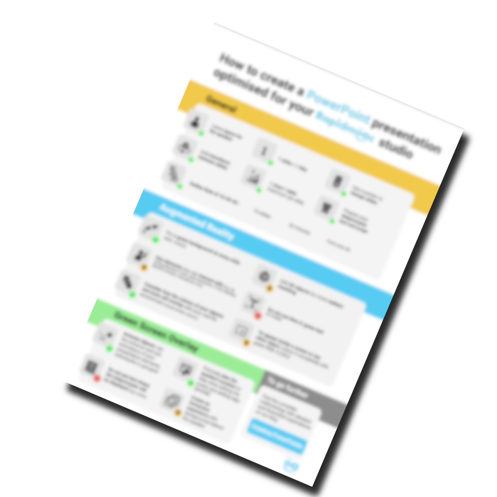
- Layout
- Augmented reality
- Green screen
- Golden rule
Download the free Cheat sheet
FAQ
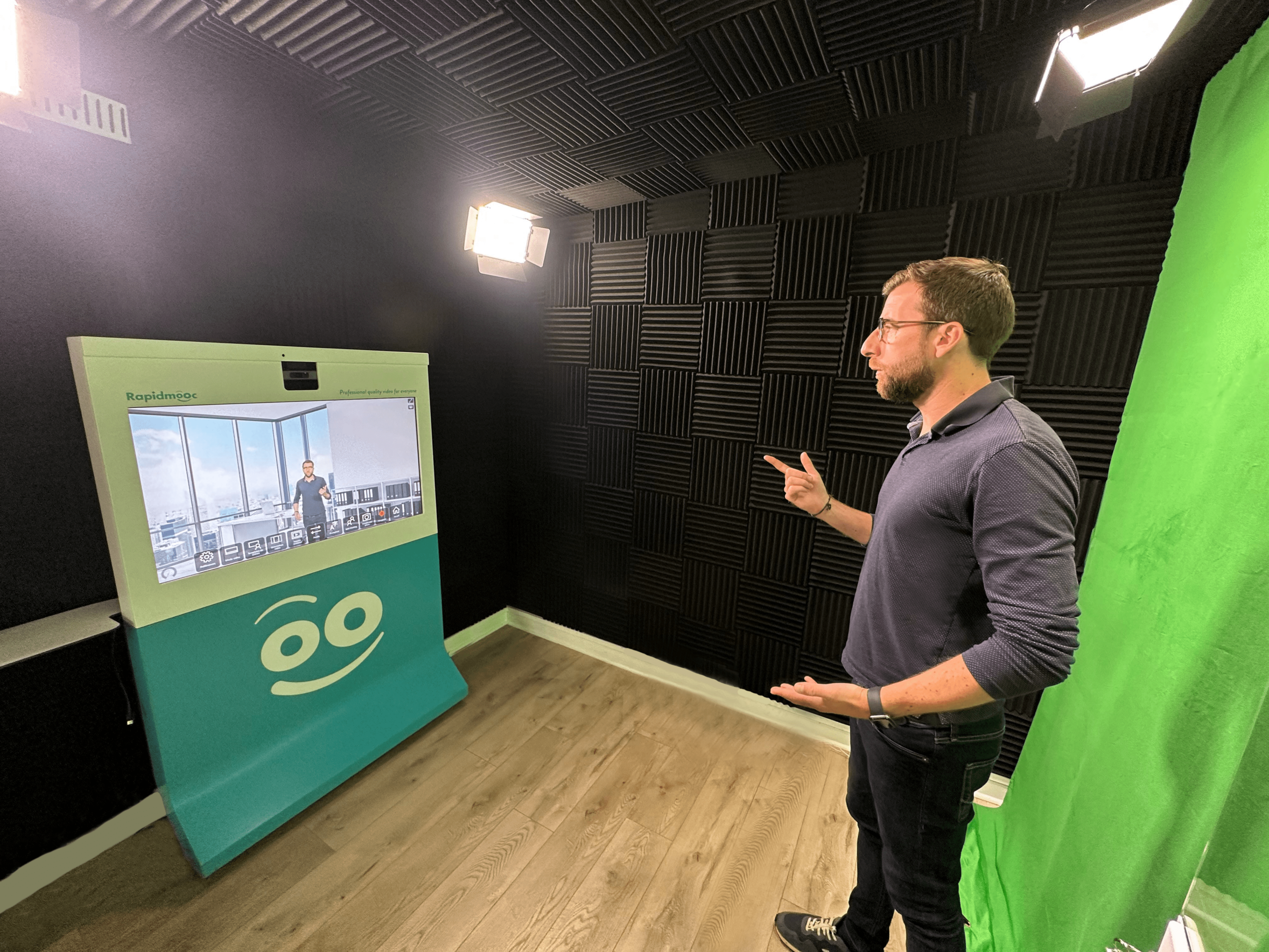
Why should I optimise my PowerPoint for Rapidmooc recordings?
Optimising your PowerPoint presentation helps ensure that your visuals are clear, engaging, and adapted to the Rapidmooc recording modes. A well-prepared slide deck can save editing time, keep your audience focused, and create a more professional final video.
How many elements should I include on a slide?
Keep it simple. Aim for one idea per slide with minimal text, supported by clear visuals or icons. Rapidmooc allows you to stand next to your content, so you don’t need to overload the slide—let your voice do the explaining.
Which fonts work best for video presentations?
Choose clean, sans-serif fonts like Arial, Calibri, or Helvetica for readability. Make sure text is large enough to be seen clearly on screen—typically no smaller than 24 pt.
What colours work best on slides for video recording?
Use high-contrast colour combinations like dark text on a light background (or vice versa). Make sure there’s enough contrast between the text and background to maintain readability—especially if you’re recording in green screen mode or standing in front of your slides.
Should I leave space on the slide for myself when presenting?
Yes! If you’re using side-by-side or overlay modes, design your slides with empty space on one side (usually the right or left) so that your body or image doesn’t block important content.